By mycapricess on
Jan 04, 2016
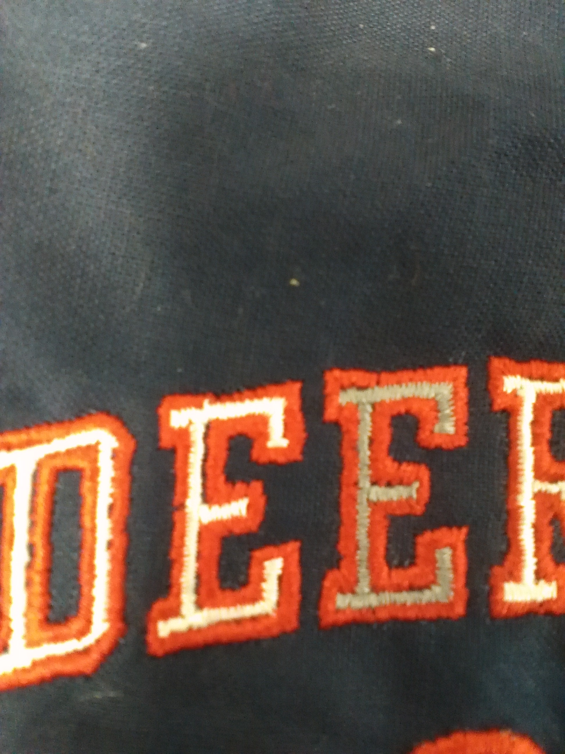
I have attached a picture of some font my wife is trying to use. As you can see it looks lousy. There is a gap between the letters and the lines are not real crisp. We have a Tajima and are using pulse software. Any ideas of what were doing wrong?
Thank You
Attachment:
Re: Help with Font
most stock two-color fonts don't do well. a couple of things to check.
1. i don't know your software, but you can try adding external compensation to the inside color...that should make the inside stitches wider.
2. if the machine is stitching the inside of all of the letters first, and then going back to do all of the outlining, split it up, so that it stitches only one or two letters with the gold, then go directly back and stitch the outline, then the gold of the next two letters, then the outline, etc.
3. it looks like your tensions may also be off. that could definitely throw it off. it looks kind of inconsistent and loopy.
i'd also be happy to take a look at the file if you still need help. dana@dixiedesigns.net
digitizing...since 1996. dixiedesigns.net
Re: Help with Font
Try https://www.myfonts.com/WhatTheFont/
Steve
Embroidery Digitizier and Color Separation
20 Years Experience
(Price : 10 USD Flat OR 1.5 USD/1000 Stitches)
First Two designs Free to Try
gnizitigid@gmail.com
Re: Help with Font
Looks like you need underlay for both colors, I would probably add perpendicular and zigzag to both and increase the pull comp on the cream color
enough to fill in the gap and maybe overlap a little into the dark outline. Not sure what fabric you are sewing on but this will give you a starting place. If you want you can email design to me and I will help if I can.
Michaeline
mrieck@contraryacres.com
Michaeline Rieck
Heartland Stitchworks
4239 Springview Dr.
Grand Island NE 68803